
Advanced Portfolio
Welcome to my blog... This blog will be updated regularly with new work from my second year as a Media stduent. This blog is for my advanced portfolio in which we have to plan, produce and evaluate a music video. I hope you emjoy the blog and feel free to use it as help for your own. Contact me here if needed: lukethorntonsidney@gmail.com
Wednesday, 3 April 2013
Blog Closed
This the final post for this blog. I am happy to say that this blog is now finished for my A2 coursework section of my Media course. I wish you all good luck, for the future, and feel free to use this blog for support in the creation of your own blog posts.


Friday, 1 March 2013
Final Music Video
Here is our final music video, unfortunately we couldn't upload it to YouTube due to copyright issues, the sound was removed so alternatively we uploaded it to Vimeo for viewers to watch. Here is the link; Enjoy.
http://vimeo.com/64671552
http://vimeo.com/64671552
Thursday, 31 January 2013
Evaluation question 4
This question required two alternative videos, due to my phone dying, half way through filming.
Question 4 Part 1
Here is the video for my question 3 of the evlauation stage. The video was shot on my phone, so please be patient with it, and i also apologise for the background noise.
Question 4 Part 1
Question 4 Part 2
Wednesday, 30 January 2013
Evaluation question 3
Here is the video for my question 3 of the evlauation stage. The video was shot on my phone, so please be patient with it, and i also apologise for the background noise.
Tuesday, 29 January 2013
Evaluation Question 2
Here is my prezi for Question 2 of the evaluation stage i which the question is "QUESTION/TWO: HOW EFFECTIVE IS THE COMBINATION OF YOUR MEDIA PRODUCT AND ANCILLARY TEXTS?".
Monday, 28 January 2013
Evaluation Question 1
QUESTION/ONE: HOW DOES YOUR VIDEO USE, DEVELOP OR CHALLENGE THE FORMS AND CONVENTIONS OF REAL MUSIC VIDEOS?
Our final music video, has the look and feel of an amateur music video, with the tools and features used to portray conventions of real music videos. To class it as a music video certain conventions had to be followed in order to create our own version of the very powerful Eminem Beautiful. Throughout the creation of our music video we challenges music conventions such as;
Eminem beautiful is a music video that was shot in Detroit, and directed by Anthony Mandler. The music video works effectively by starting with captions explaining that Detroit, Michigan, was one of the busiest places in the world, producing 36% of the total GNP. IT then cuts to the present day Detroit, Michigan, in which you can see the city is run down.
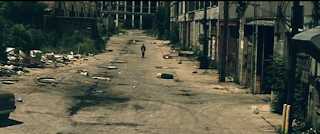 The music video features three distinct buildings, appropriate to the 1950's. Three people appear throughout the video, closely relating to the buildings, with some sort of link or response to the situation of them. One of the buildings include, Tiger stadium, which is being demolished, in which children would once play ball.
Camera Shots/Angles
Our music video uses a range of different camera shots and angles, to express the feel of the music video. When the song has slow, meaningful lyrics, we tried to match the shots with the words as closely as possible, and when the lyrics increase we have a faster pace to the video. For example "Lately I've been hard to reach, I've been to long on my own..." we have slow shots, making the scene feel depressing along with the meaningful lyrics.
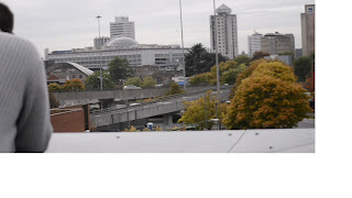 With our music video we wanted to give the audience a feel for what they were looking at, and therefore the shot on the roof, not only poses a close up and emphasis's the lyrics in the song, but also an establishing shot, so the audience can get a feel for the location of the music video.
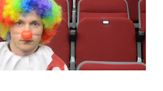 Throughout the music video we did not use very many extreme close ups, due to the face a simple close up is effective in itself. At the end of the music video we have a medium shot to show the entire person in the shot and the emotion running through them. For example when the chorus kicks in and we are standing there, because the lyrics are emotional, and have such a deep meaning you can see that not much eye contact is made with the camera.
Now camera movement is not a very big subject in our music video. As we did not film too many walking scenes where the camera would need to follow the person, we did some simple zooming and panning shots instead. This enables for professional looking shots with minimal effort. On the bridge, we panned the shot to get a lot of the scenery in and the main character all in a space of 5 minutes.
Cutting/Editing
Another major factor in creating a music video is the way you edit and cut your clips to piece together the puzzle. A lot of our clips were long, so to make them shorter and make them fit into the music video we editing, the clips to make them smaller, and just have the content we needed from the clips. With some of our clips we slowed them down so it is clearer for the viewer to see the shot.
With editing, the type of editing can differ from the style of the music video, so for a music video like Eminem Beautiful, the video is slow, and a range of around 4 main shots are used, establishing shot, close up, extreme close up & mid shot. With Eminem beautiful, although the shots bounce around from location to location, the editing is very smooth and seems consistent when walking through a location. This style of editing, is consistent throughout the music video making it seamless throughout, the audience would not notice it.
We challenged various conventions of editing with our music video;
With our music video, we had to add lighting effects to various clips due to the weather, on some days we shot the weather was nice and then went dull again, so to correct the colour of the shots, we changed the lighting to make it seem like it was still a dark and gloomy day.
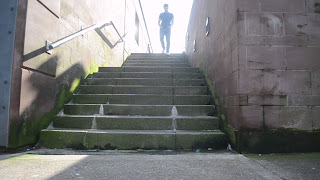 The colour of some of the shots seemed a little off, so we added colour correction, too see what the effects on the shot were, however we did not like the look of the shot with colour correction placed on it, it didnt seem as natural or authentic as the original clip. With some of the clips we shot, whilst location scouting, the colour and position of some of the shots made for an effective shot. The natural lighting and colour of the shot, made for a bright yet gloomy looking shot.
For the location of the music video, we shot in many different locations, including, our classroom. The locations were good, as they were all in and around the same area, however each area offered a different feel too it, allowing for a wider spectrum of shots.
Locations included (In order of appearence);
With our music video, we tried to match our constumes to the feel of the music video, with the exception of the clown costume, which we included as Eminem is talking about feeling like a clown around people.
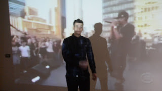 With our music video we did not really use props besides the clothing i.e. t-shirts, cardigans, jeans, jackets etc., as we felt that the music video was more of an emotional rap video, compared to others where they are holding bottles of alcohol, cars, women etc.
Our final music video, has the look and feel of an amateur music video, with the tools and features used to portray conventions of real music videos. To class it as a music video certain conventions had to be followed in order to create our own version of the very powerful Eminem Beautiful. Throughout the creation of our music video we challenges music conventions such as;
- Narrative Structures
- Camera Shots/Angles
- Cutting/Editing
- Lighting/Colour
- Mise En Scene
Eminem Beautiful
Eminem beautiful is a music video that was shot in Detroit, and directed by Anthony Mandler. The music video works effectively by starting with captions explaining that Detroit, Michigan, was one of the busiest places in the world, producing 36% of the total GNP. IT then cuts to the present day Detroit, Michigan, in which you can see the city is run down.
 The music video features three distinct buildings, appropriate to the 1950's. Three people appear throughout the video, closely relating to the buildings, with some sort of link or response to the situation of them. One of the buildings include, Tiger stadium, which is being demolished, in which children would once play ball.
 Camera Shots/Angles
Our music video uses a range of different camera shots and angles, to express the feel of the music video. When the song has slow, meaningful lyrics, we tried to match the shots with the words as closely as possible, and when the lyrics increase we have a faster pace to the video. For example "Lately I've been hard to reach, I've been to long on my own..." we have slow shots, making the scene feel depressing along with the meaningful lyrics.
One of the big shots in our music video, is our establishing shot... In the original Eminem Beautiful, we have him walking through parts of Detroit in which you can see the city run down, and in our music video when we are on the roof you can see that the city is not exactly run down, but it isn't by far, spectacular.

Close ups and mid shots are effective for seeing the emotion on a characters face therefore were used often throughout the filming process. Not only does it show emotion on their faces but you can get an
insight into what they are thinking.
 Throughout the music video we did not use very many extreme close ups, due to the face a simple close up is effective in itself. At the end of the music video we have a medium shot to show the entire person in the shot and the emotion running through them. For example when the chorus kicks in and we are standing there, because the lyrics are emotional, and have such a deep meaning you can see that not much eye contact is made with the camera.
Cutting/Editing
Another major factor in creating a music video is the way you edit and cut your clips to piece together the puzzle. A lot of our clips were long, so to make them shorter and make them fit into the music video we editing, the clips to make them smaller, and just have the content we needed from the clips. With some of our clips we slowed them down so it is clearer for the viewer to see the shot.
We challenged various conventions of editing with our music video;
- Through playing around with clips, the speed of clips and the duration of clips we were able to match the video to the pace and feel of the song,
- Depending on the lyrics in the song, the order and pace of clips in the music video would decrease/increase to make the feel of the music video match the feel of the song.
- Due to the short timescale for the filming of our music video, through playing with clips, we could add effects to them, to blur out parts of the clip, crop the clip to ensure it seemed professional throughout,
- As some of the shots had gone wrong, Adobe Premiere enables us to alter the clips so they were still usable, through cropping and blurring we salvaged the clips into an effective scene in the video.
With our music video, we had to add lighting effects to various clips due to the weather, on some days we shot the weather was nice and then went dull again, so to correct the colour of the shots, we changed the lighting to make it seem like it was still a dark and gloomy day.
 The colour of some of the shots seemed a little off, so we added colour correction, too see what the effects on the shot were, however we did not like the look of the shot with colour correction placed on it, it didnt seem as natural or authentic as the original clip. With some of the clips we shot, whilst location scouting, the colour and position of some of the shots made for an effective shot. The natural lighting and colour of the shot, made for a bright yet gloomy looking shot.
Location
For the location of the music video, we shot in many different locations, including, our classroom. The locations were good, as they were all in and around the same area, however each area offered a different feel too it, allowing for a wider spectrum of shots.
Locations included (In order of appearence);
- Bedroom - A dark lighting room, allowed for a gloomy opening to the music video
- Roof - was a good establishing shot, seclduded from everywhere and everyone else
- City Centre - Offered soem long shots, jump cuts and 'an all over the place' feel to the section of the music video.
- Theatre - Here is where we shto the clown scene, closely matchign the lyrics to the song.
- Classroom - With this shot that you see at the end, we had the projector showing an eminem performance... This had a good feel too it, along with the depressing lyrics, we felt it fit correctly in the music video.
With our music video, we tried to match our constumes to the feel of the music video, with the exception of the clown costume, which we included as Eminem is talking about feeling like a clown around people.
 With our music video we did not really use props besides the clothing i.e. t-shirts, cardigans, jeans, jackets etc., as we felt that the music video was more of an emotional rap video, compared to others where they are holding bottles of alcohol, cars, women etc.
The standard Rap music video you will see, women, alcohol, technology, flashing lights etc. with our music video we challenged this and kept it simple, however the use of the projector is generally not seen in a music video of todays age.
Friday, 11 January 2013
Final Digipak
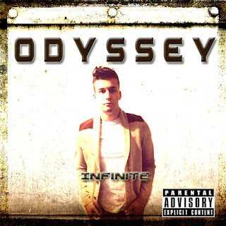
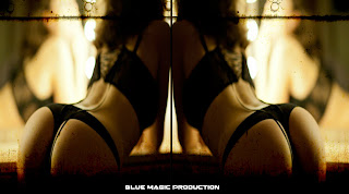
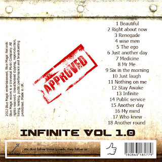
The above images are of the digipak (Final version) The first image is the front cover, the second image is the inlay and the final image the back. With our front cover it is clear we have used one artist on the album cover, the reason behind this is we wanted to have one artist to be the front man of the group. We used the parental advisory sticker on the cover as well as this was something that featured on album covers within the same genre. Moving on to the inlay now, the symmetrical image of the girl from behind may shock some people, however once again after doing research into digipaks from the hip hop genre, these kind of images were highly featured (50 CENT The Massacre) It also links in with the Laura Mulvey theory and the male gaze and therefore we decided to put it in. Finally the back of the digipak. As you can see the background is continuous from the front image, we have done this for consistency purposes. The layout is based on Eminem's curtain call album as we wanted to make sure we were doing it right in line with typical hip hop conventions.
Subscribe to:
Comments (Atom)


